
Intro
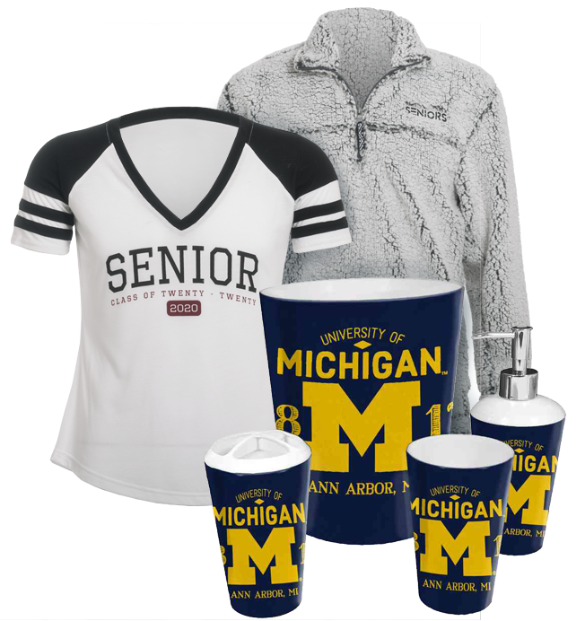
Balfour has a traditional core product line; class rings, yearbooks, and graduation gear. Students and parents order these through a representative working with their school and fulfill orders on the site.
GradImages does event and graduation photography. Students and parents purchase their photos and photo packages.

GradImages: Graduation ceremony and event photos
Balfour: Class Rings, Yearbooks, Graduation regalia
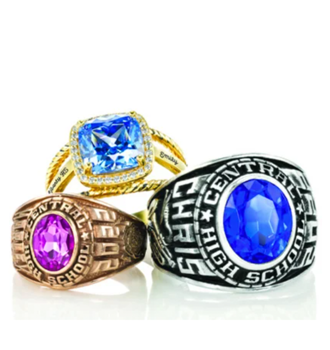
Core product: Class rings, Cap & Gown, Yearbooks
Extended Assortment (EA).
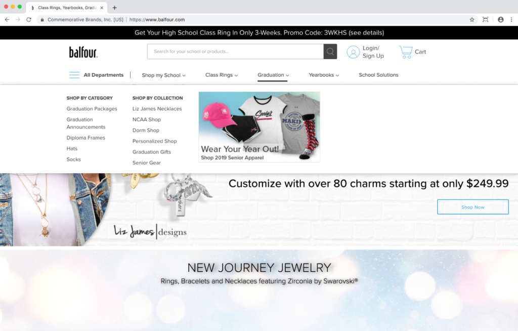
When these two companies merged, my boss and I (coming from Grad) were asked to conduct a test of a new navigation design created by Balfour.
The new navigation had two primary goals.
- Expose new and growing Extended Assortment options to customers.
- Make their navigation categories more clear.
Balfour believed customers did not understand the navigation categories.
Schools and Sales Representatives objected to EA products in the school scoped experience.
- EA products compete with the school’s store.
- Sales Reps do not make a commission on most EA products.
What they did about it
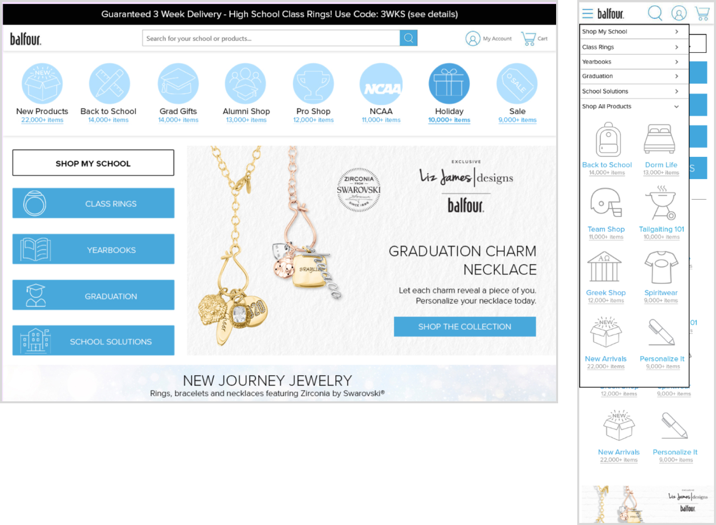
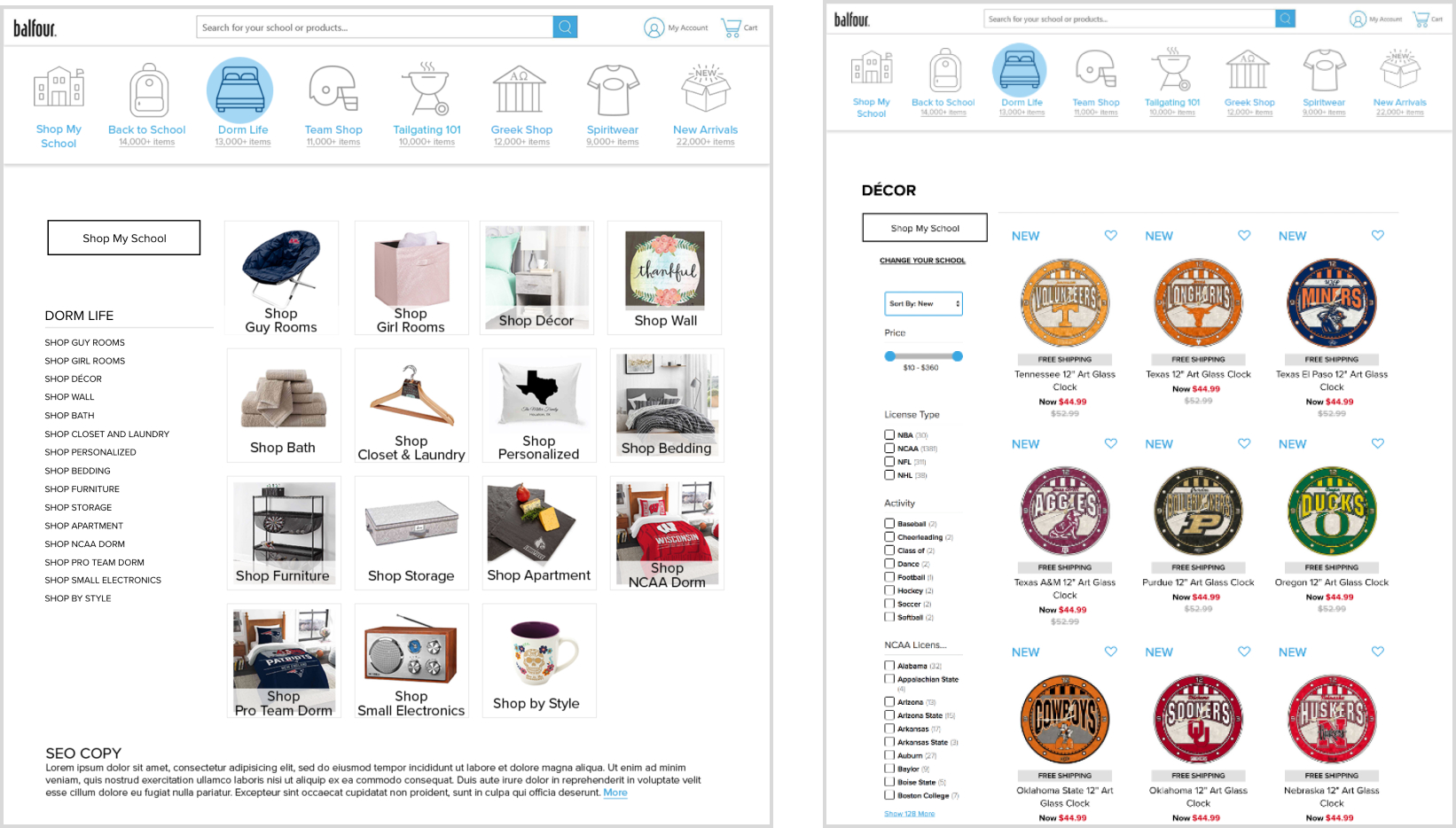
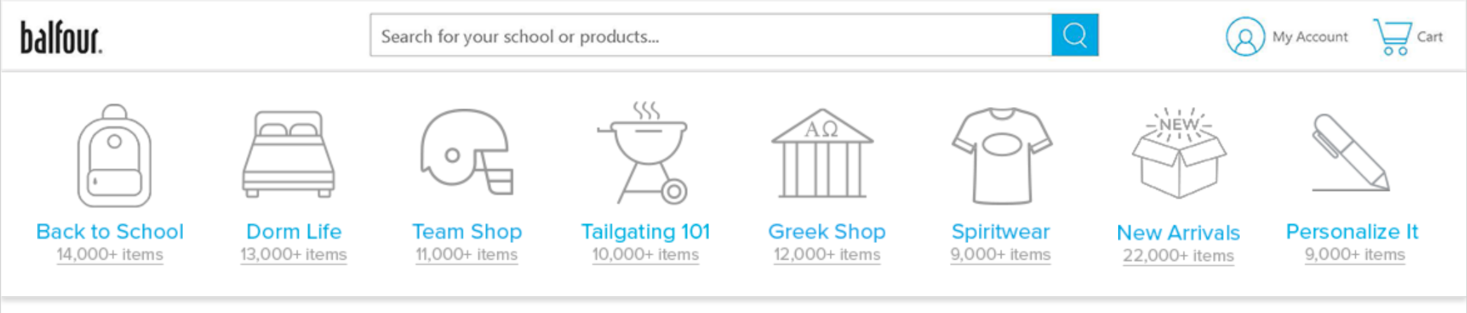
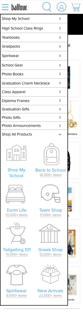
Made one level of navigation with categories represented by icons or images.
Icon navigation takes customers to category pages to see sub-categories and from there, product listing pages.
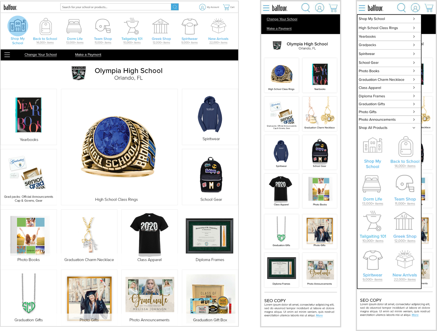
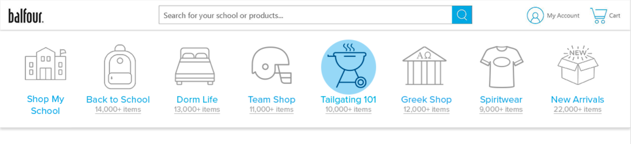
After the Home Page, the first icon in the navigation becomes Shop My School which scopes and directs customers to their School Page.
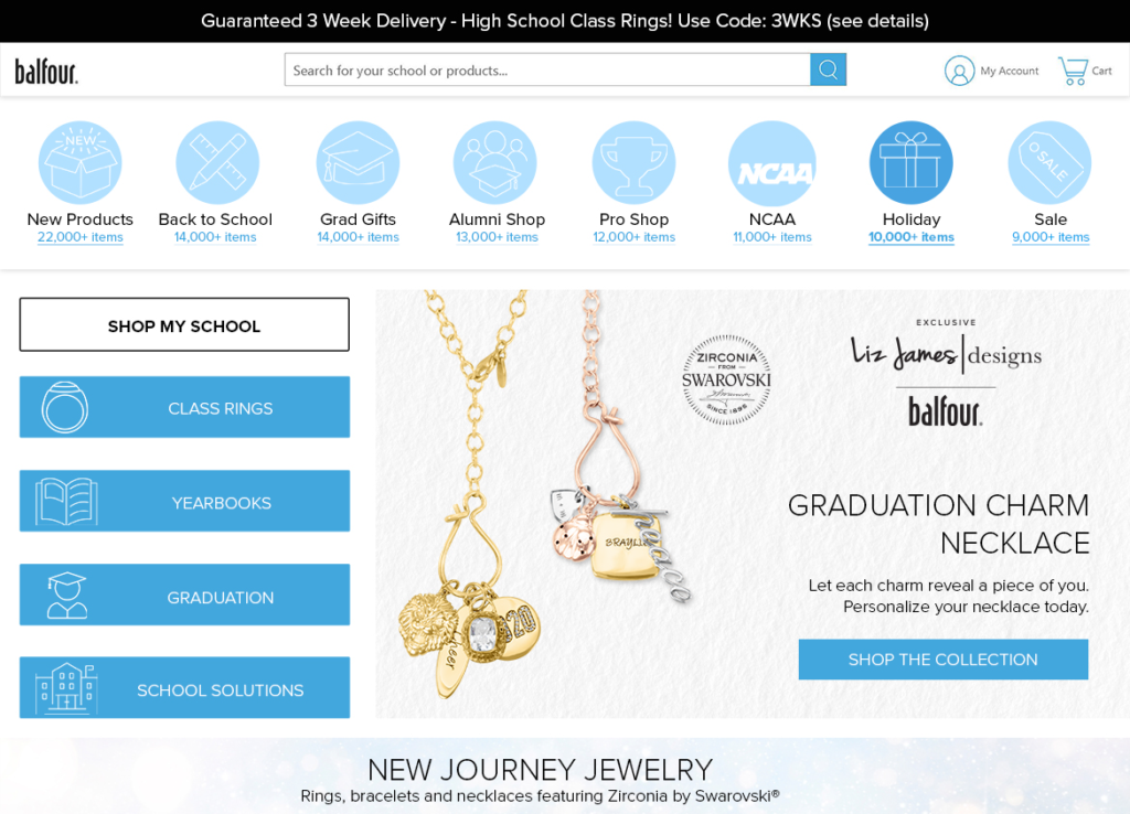
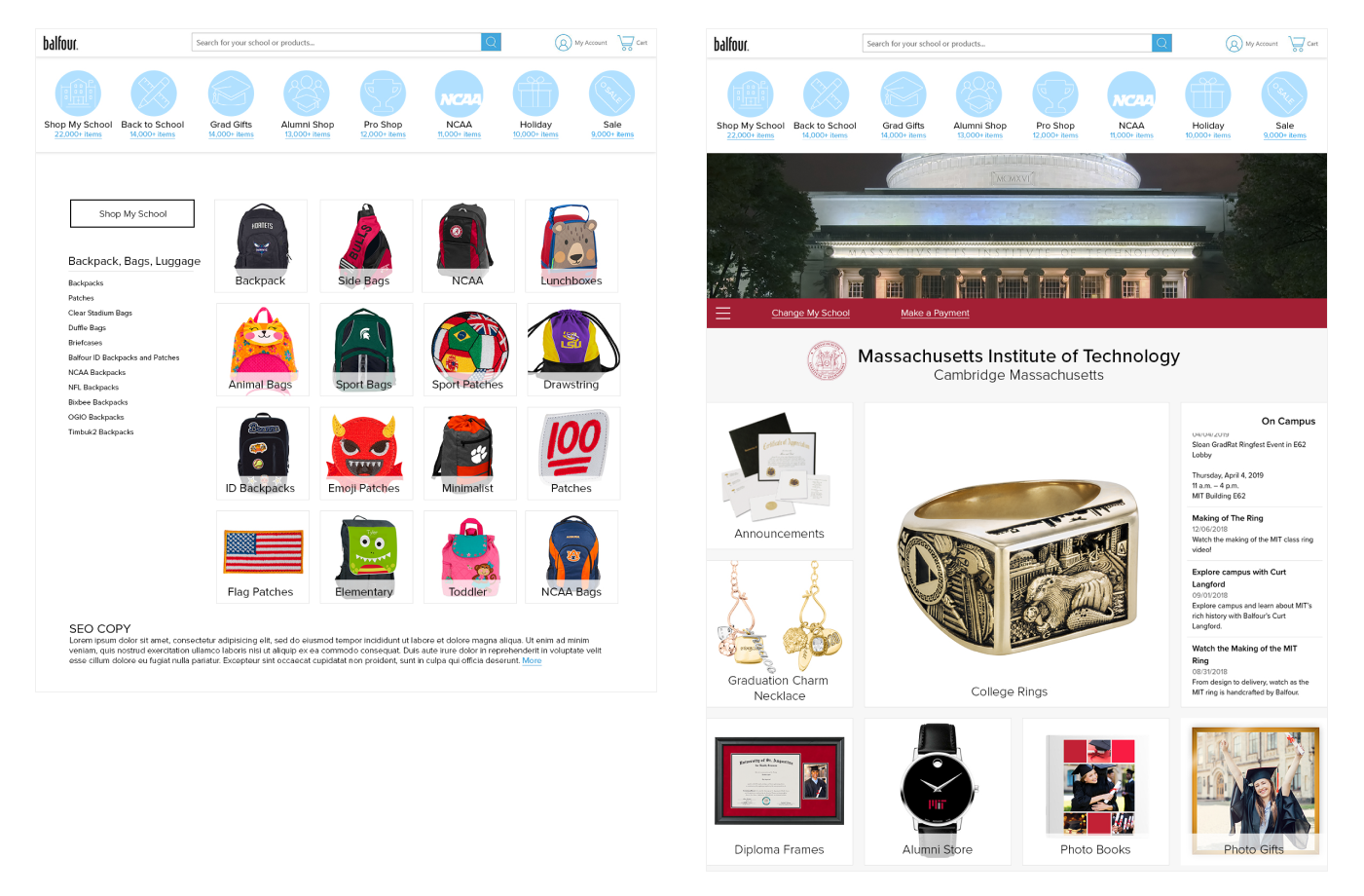
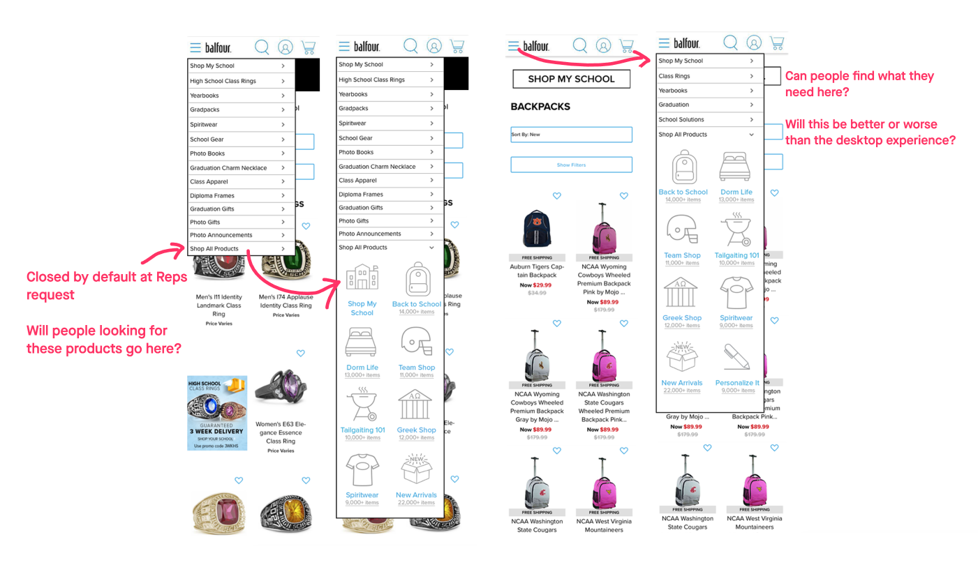
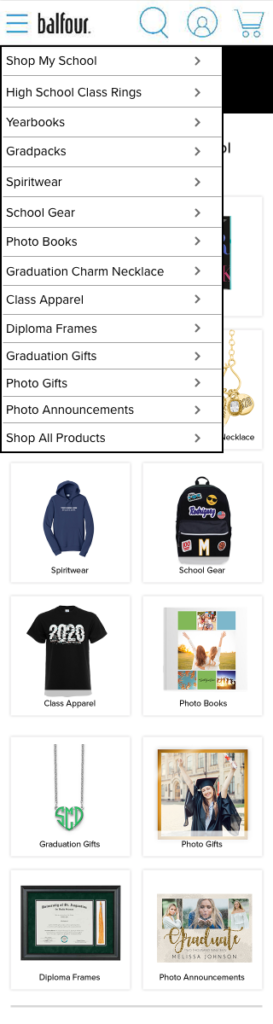
Navigation for the Core and school product will be in its own navigation within the hamburger menu.
Customers checked into school leave that scope when they click any EA navigation. (Again to appease reps and schools)
For mobile on the School Page, the Icon Nav would be tucked into the hamburger menu with the core navigation.
What We Wanted to Know
A. Will icons help customers understand a whole category?
B. What happens when navigation expands beyond 9 categories?
C. Will customers have problems if what they find in a category is not what they expect?
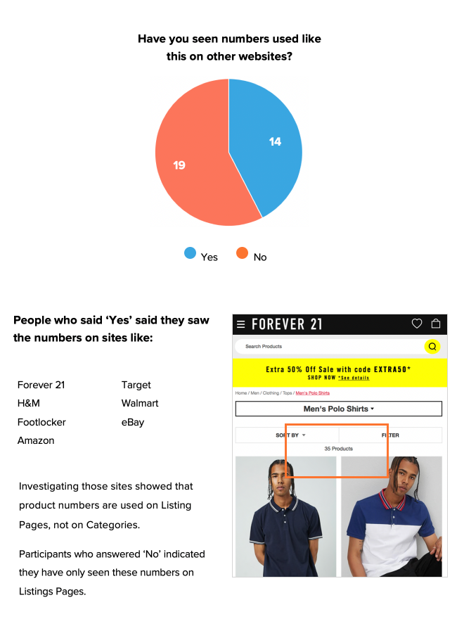
D. The use of number-of-items in a global navigation is unusual. What will customers think about these?
A. Shop My School is added and one of the categories gets dropped. We anticipated customers not liking this.
B. How will customers respond to the subcategories? Are they what they expect?
C. Are the images helpful to customers?
D. What are customer expectations for Shop My School?
E. Will customers understand that these products are not a part of their School Shop experience?
A. Will customers understand what is offered on this page?
B. Mobile: Will customers understand the categories in the menu, their connection to the page categories, and the Shop All Products categories?
Our Plan
7 Test Groups. 4-5 participants each. We looked for a mix of students, recent students, parents and grandparents.
I set up 2 test paths, one starting from the home page and the second from the school shop. Both paths tested:
- how well people found Core products in any instance
- if people could find products via the new icon based navigation.
- if people unsderstood the school shopping experience versus shopping for product not tied to their school.
- could people navigate away from their school shop and find their way back.
What we learned - Home and Navigation
Item numbers: Most had not seen numbers used this way.
Those that said they had seen numbers used this way cited sites that turned only used item numbers on listing pages.
How did they feel about the numbers overall?
“These numbers are a lie!”
– Jacoby
Navigation after the Home Page
Most were surprised to see the Shop My School icon show up.
While they weren’t too confused about the new icon’s function, all participants were upset that a category disappeared with no way to access it.
On Home Page
After Home Page
What we learned - School Shop
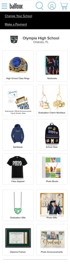
“The products don’t seem product specific to my school, don’t have logos. I assume this is my school’s page because of the branding.”
– Jazmyn
“The home page was more appealing, a lot of visuals, bigger pictures. Larger text is easier to see.”
– Tatyanna
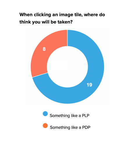
30% thought the tiles would take them directly to that product.
Unlike Desktop, mobile testers had a lot of trouble finding the icon navigation that lives on the top of the page on desktop.
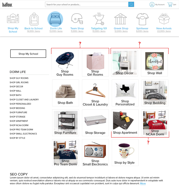
What we learned - Category Page
“I would like to see them in context to see how it would be used.”
– De’Anna
“I don’t think these should be gendered… these are grown people, they can choose what they like.”
– Michelle
People weren’t sure of the difference between Dorm and Apartment. Also, they felt Wall would be a part of Decor.
People were less clear about what to expect on several categories at this point.
This is where the icon navigation scheme starts breaking down.
Conclusion
We had several recommendations which we worked on over the next year and a half. The first big change was fixing global navigation.
What I learned:
- Seeing the participants’ reactions to what they experienced.
- Hearing what they had to say about it.
- Having the chance to follow up with them and better understand the whole story.
I wish I could take notes faster, or took my own recordings. I was not able to catch all the quotes from the testers which was a shame.